About the project LSRE Solutions
Task
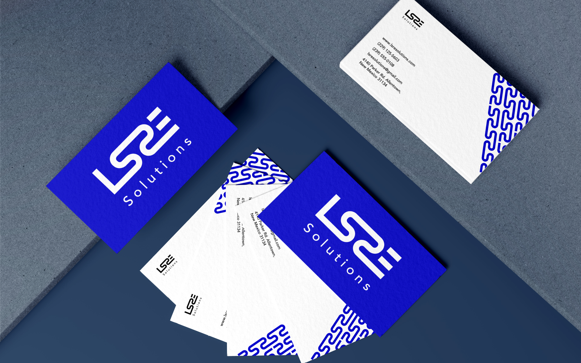
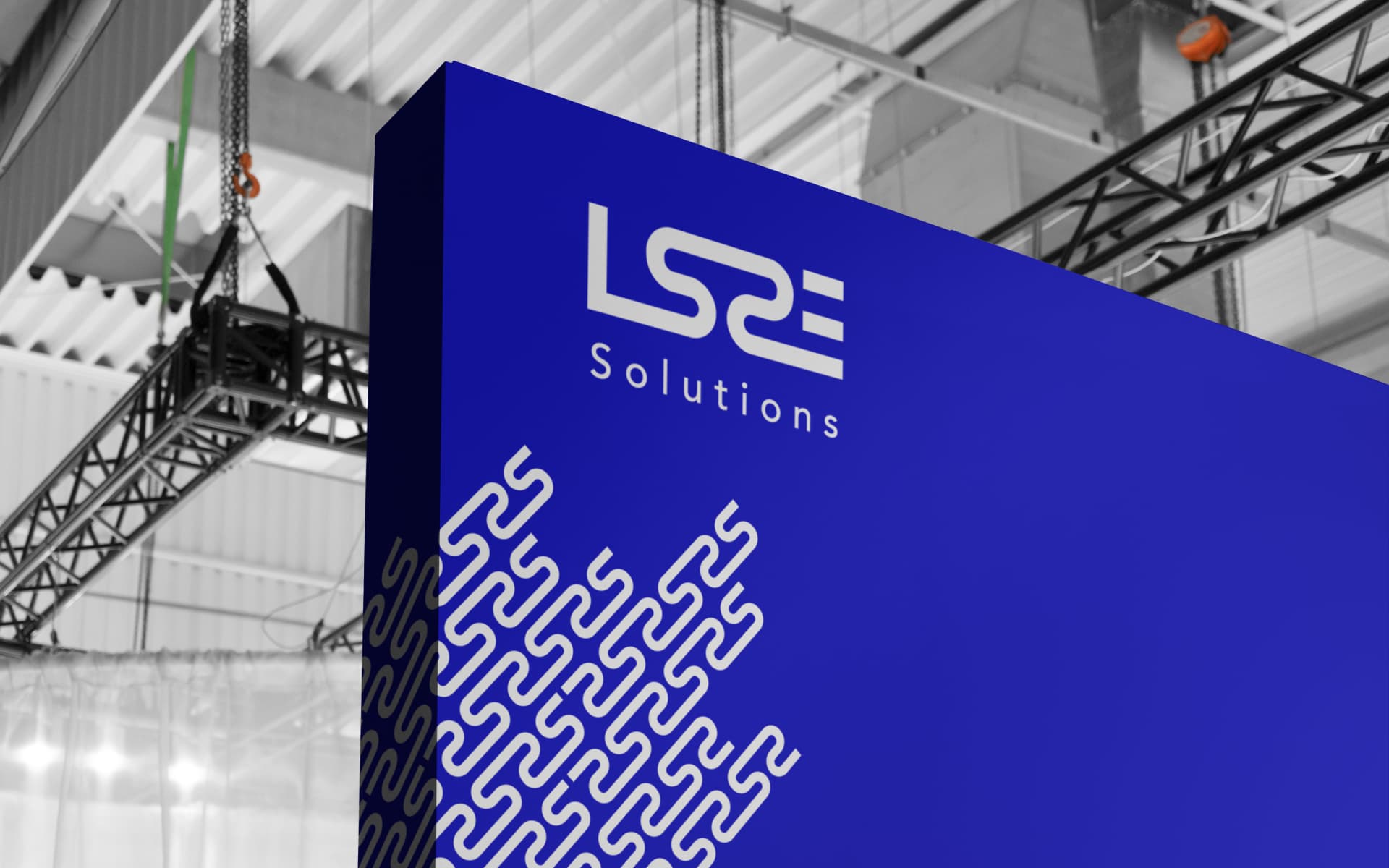
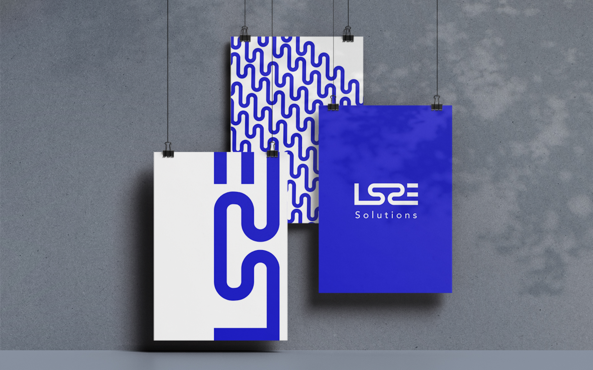
The branding of LSRE Solutions is aimed at creating a strong, recognizable identity that accurately represents their focus on life science-related real estate. The use of waves in the logo design serves to symbolize the preservation of nature and the development of technology and science. This design choice emphasizes the company’s commitment to sustainable development, which is essential in the life sciences industry.
Style
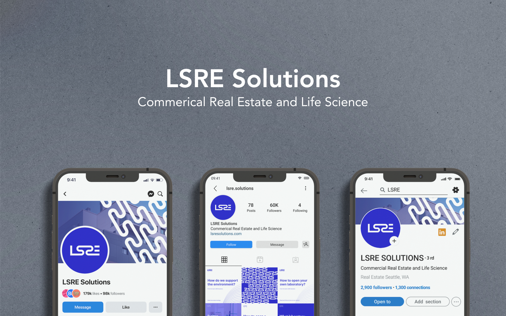
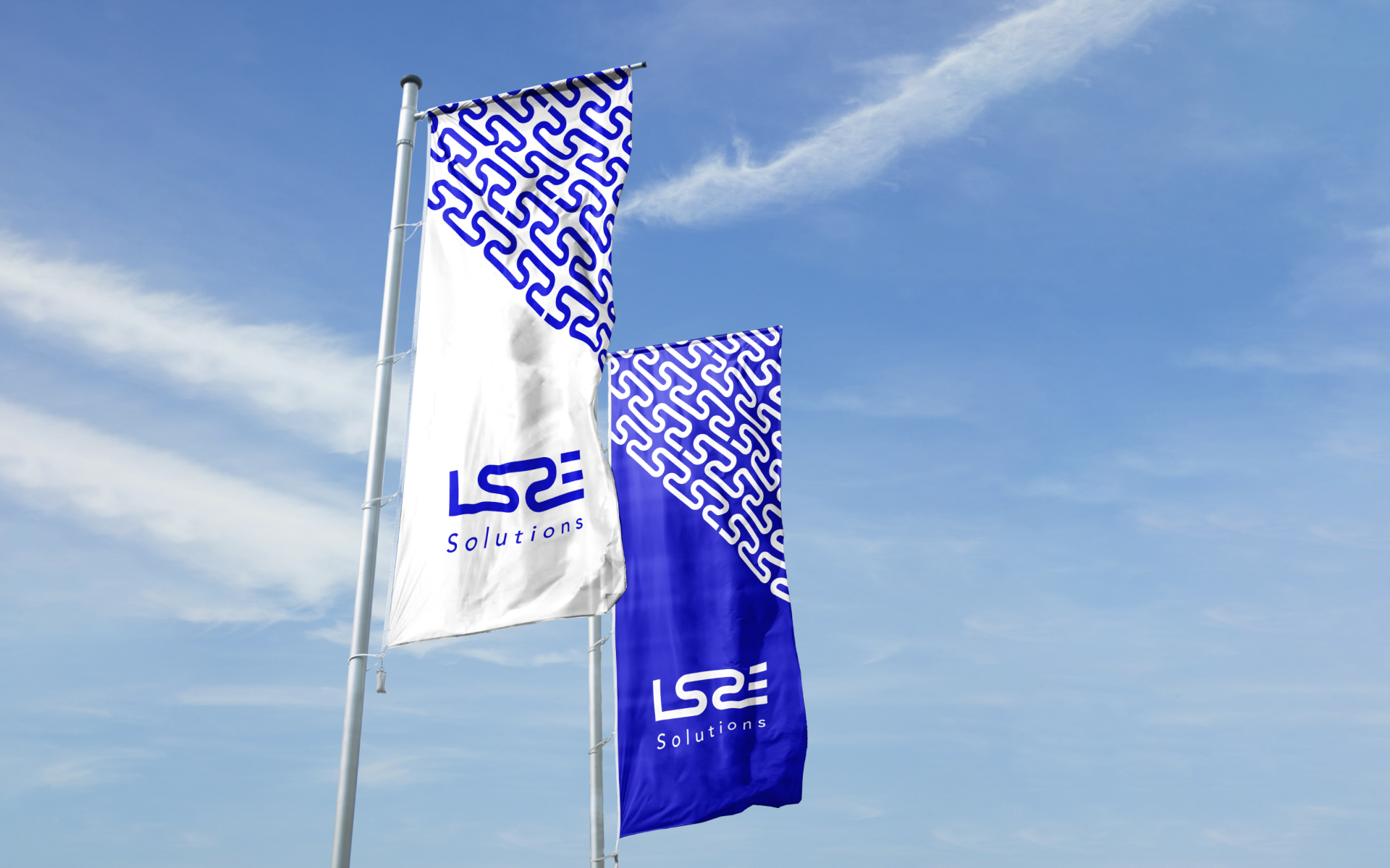
The blue and green colors used in the branding are also significant in representing the company’s ideology and principles. Blue symbolizes trust, stability, and professionalism, while green represents growth, innovation, and sustainability. These colors help to convey the company’s mission and values through visual design. The fusion of letters in the logo design also reflects the unity of vision within LSRE Solutions. This design choice shows a company that is confident and strong, with a clear direction and purpose. The minimalistic approach to branding serves to make the logo representative and powerful, while also creating a memorable and recognizable brand that people can trust.

Result
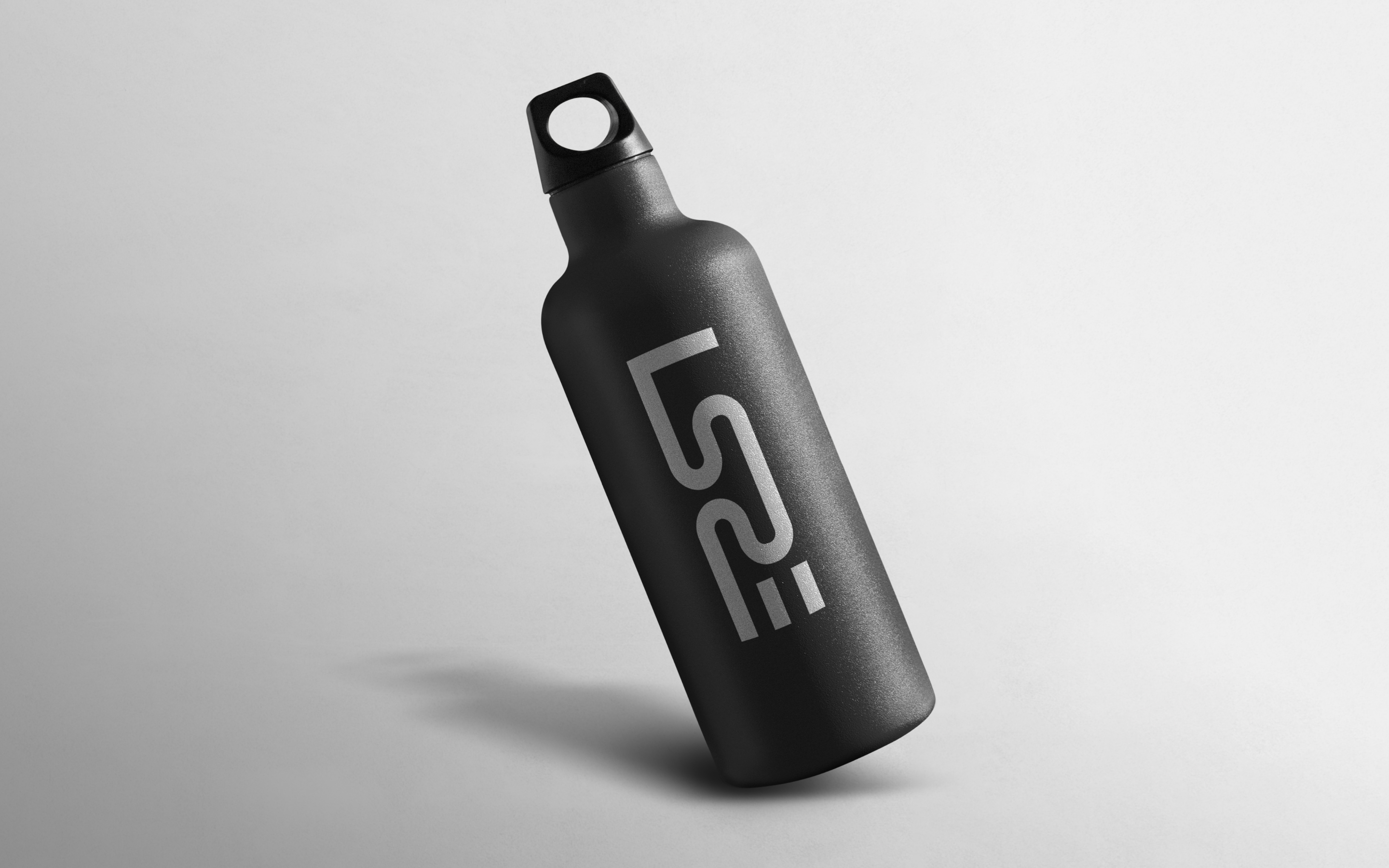
Overall, LSRE Solutions branding is carefully crafted to accurately represent the company’s focus on life science-related real estate. The use of waves, blue and green colors, and the fusion of letters in the logo design create a powerful and memorable brand that accurately represents the company’s values and goals.
